Avatar
Shapes
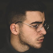
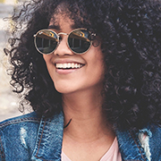
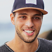
Default avatar is square in shape. For rounded and circle avatar add .avatar-img .roundedand .avatar-img .circlemodifier classes respectively.
Sizing
Fancy larger or smaller avatar? Add .avatar-xl, .avatar-lg, .avatar-md, .avatar-smor .avatar-xsfor additional sizes. For custom sizes use sizing utilities- e.g. d-14 or d-20.
Avatar with initials
In need of an avatar, but not the image avatar? Replace the default modifier class with .avatar-text .avatar-text-*ones to create avatar with name initials.
| Class | Values |
|---|---|
class="avatar-text avatar-text-[value]" | primary / success / warning / danger / info / light / dark / red / green / pink / purple / violet / indigo / blue / sky / cyan / teal / neon / lime / sun / yellow / orange / pumpkin / brown / grey / gold / smoke |
Avatar with inverse initials
Replace the default modifier class with .avatar-text .avatar-text-inv-*ones to create avatar with inverse colors.
| Class | Values |
|---|---|
class="avatar-text avatar-text-inv-[value]" | primary / success / warning / danger / info / red / green / pink / purple / violet / indigo / blue / sky / cyan / teal / neon / lime / sun / yellow / orange / pumpkin / brown / grey / gold / smoke |
Groups
Wrap a series of avatars with .avatarin .avatar-group. Use .avatar-group-lgand .avatar-group-smfor additional sizes.
Overlapped Avatar Group
For overlapped group of avatars replace default modifier class with .avatar-group-overlapped.
Adding icon to avatar group
Add icons instead of initials by using i tag inside avatar. Change the font sizes using font utilities.