

Dropdowns
Dropdown & Dropup Buttons
Dropdowns can be triggered from anchor or button elements. Wrap the dropdown’s toggle (your button or link) and the dropdown menu within .dropdown.
Dropdown directions
Trigger dropdown menus above elements by adding .dropup, .dropleftor .droprightto the parent element.
Menu Alignment
By default, a dropdown menu is automatically positioned 100% from the top and along the left side of its parent. Add .dropdown-menu-rightto a .dropdown-menuto right align the dropdown menu.
Sizing
Button dropdowns work with buttons of all sizes, including default and split dropdown buttons.
Fancy Dropdowns
Use animation classes from animate.css to quickly change the appearance of a dropdown. e.g.data-dropdown-in="rollIn" data-dropdown-out="rollOut"
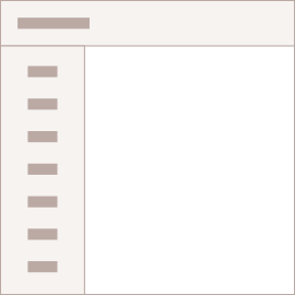
Menu content
Create menu items with button or anchor tags. You can also add non-interactive dropdown items or add a header to label sections or separate groups with a divider.
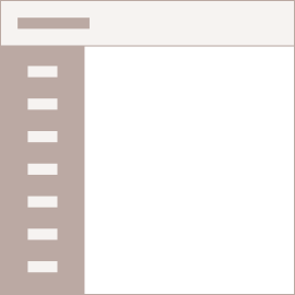
Adding Text
Place any freeform text within a dropdown menu with text and use spacing utilities or simply use.dropdown-item-textclass.
Only text
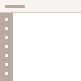
Dropdown with icon
Add an icon using i tag within .dropdown-item
Menu forms
Put a form within a dropdown menu, or make it into a dropdown menu, and use margin or padding utilities to give it the negative space you require.
Dropdown inverse
Add .dropdown-menu-darkmodifier class to change the dropdown look to a dark one.